Stellar Demo Tutorial
Before you Install the Stellar Theme
To install this theme you must have a working version of WordPress and the IgnitionDeck Crowdfunding plugins already installed, registered, and set up.
- For instructions on how to install WordPress, please see WordPress.org’s documentation.
- For instructions on installing IgnitionDeck, see the main IgnitionDeck Documentation.
Set your home page content in Settings > Reading > Front Page displays. To create the home page like the demo, select “Latest Post”.
Above the Project Grid
Home Hero

The hero unit has 3 options available:
- the static image which is the default setting. Replace this image with your own image (recommended size 1920 x 920 px), or
- the Home Hero Section widget to add a text based widget, or
- use a slider plugin like the Revolution Slider to add action buttons like the Stellar demo.
For the Static image, select your image using the Add Image button which will open the Media library. You can select an image you have already uploaded or use the Add Media upload option to add a new image to use.
For the Slider Shortcode, most slider plugins like the Revolution Slider will generate a shortcode that you can insert into the field here after you select this option from the menu. Be sure that your shortcode is formatted correctly, for example with the Revolution Slider: [ rev_slider slide-name ]
For the Home Hero Section Widget, navigate to the Appearance > Widgets menu after making and saving your selection in the Home Feature Options menu.
Select a widget you wish to use here. The Stellar demo uses the 500 Content Wide (custom) widget in this area. Fill out the fields with the content you wish to include in this area. A title will appear in a larger, bolder font than the regular content in the text field.
Important: You must set a Content Height is order to ensure that the content lower on the page does not roll up over this area.
Set whether you want to have your content with an image to the right, left, or centered (image will appear before the text) using the drop menu.
If you wish to add an image (Add Image: positioned in the foreground and aligned based on the previous drop menu selection) or background image (Add Background Image), first save the widget to keep your settings as you will be navigating away from this page temporarily. Click Add Image and select or upload an image from the Media Library.
You can also set the color of your text and/or the background (if you aren’t using a background image) to highlight this area. If you do not set colors here, the theme defaults will be used.
Optionally, add some padding to the top (recommended) and/or bottom to set the content off from the edge of the widget area.
Finally, add your text you wish to include in the area.
The Stellar Demo uses two buttons here, which use the button styling built into the theme. You can set these by adding a class to your link. For example:
<a href=”http://yoururl.com/?create_project=1″ class=”button”>Create Your Project</a><a href=”http://yoururl.com/projects/” class=”button border”>Browse Projects</a>
Save your changes.
The next section of widgets are all configured within the Appearance > Widgets screen of the site admin.
Home Top Content Widget
The section below the hero unit and above the project grid is the Home Top Content Widget area. You can use several widgets in this area in the Stellar demo.
The bar with the logos uses the 500 Content Wide (custom) Widget. All of the settings are left with the defaults and the images are added using the code <img src=”path-to-image” /> for each image instead of using the Add Image field. It is set as 110 px high and has the CSS class of “logocontainer” applied to it.

Next is another 500 Content Wide (custom) Widget set with a height around 350 px. The image used is 300 px in height and is right aligned. 30 px of padding is added to the top to push the image and text off of the top of the widget.
If you wish to add an image (Add Image: positioned in the foreground and aligned based on the previous drop menu selection) or background image (Add Background Image), first save the widget to keep your settings as you will be navigating away from this page temporarily. Click Add Image and select or upload an image from the Media Library. Save your changes.
Below this, the project grid will be populated automatically in 4 columns. The number of projects that will be displayed here is set in Appearance > 500 Settings > Projects displayed on Home Page. Set this in multiples of 4.
Below the Project Grid
Home Content Widgets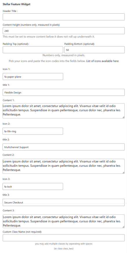

Below the project grid on the demo is the Stellar Feature Widget. This widget displays 3 columns with a title, Font Awesome icon, and the text content. The demo uses 2 of these widgets to set 2 rows of 3 columns each.
Be sure to set a height so content below doesn’t roll up over the widget area. The demo has 2 Stellar Feature widgets set up here. The first has a height of 320 px with padding of 40 px top and bottom. The next widget is 240 px in height and has 50px padding on the bottom only.
The icon fields use Font Awesome icons. A convenient cheat sheet of the available icons can be found here: http://fontawesome.io/cheatsheet/. Enter the icon using the format fa-icon-name as provided by the cheatsheet. You can also leave these fields empty and no icons will be displayed
Next add a title for each of the Features. You can further style the titles and icons using the Appearance > Customise > Colors. The Secondary Dark Color is applied to the icon and feature title.
Add your content. You may need to adjust the widget’s content height to ensure that the text is not cut off here. Finally save the widget. Repeat for the second and any additional featured widgets you add here.
Next is the Stellar CTA (Call to Action) Widget.
Add a height to the widget. 140px is a good height if your widget has a title and a single line of text. Increase the height if the text gets cut off.
Add a title, text, and a Font Awesome icon using the same format as the Feature Widget icons. Setting the text color will style both the title and the content text.
Add a link for your button and some button text. A popular option for this button is a link to creating a project which can be set with http://your-domain.com/dashboard/?create_project=1.
Footer Widgets
Finally, there are 4 columns in the Footer widget area, wider columns in the 1st and 4th columns, narrower on the 2nd and 3rd. This is a good area for additional links or inserting a sign up form for your newsletter.
The first widget on the demo is a regular Text widget with a logo added using <img src=”path-to-image.jpg” />
The second and third widgets use the Custom Menu widget. You can set up menus to use in these areas in Appearance > Menus first. Then add the widget and select the menu you wish to appear here.
The fourth widget again uses a Text Widget to create a MailChimp subscription form. Using the widget in this way requires that you set up the embed form within your MailChimp account first then copy and paste the generated code into the Text widget. Please see MailChimp’s docs on how to create a subscription form; for best results use the simple layout design provided by the MailChimp options.
If you do not want to use any of the first 3 columns, you will need to enter an “empty” text widget into the column you don’t want to use otherwise the widgets will slide to the left to fill the empty space. Use a text widget and enter into the content area to create the “empty” widget.